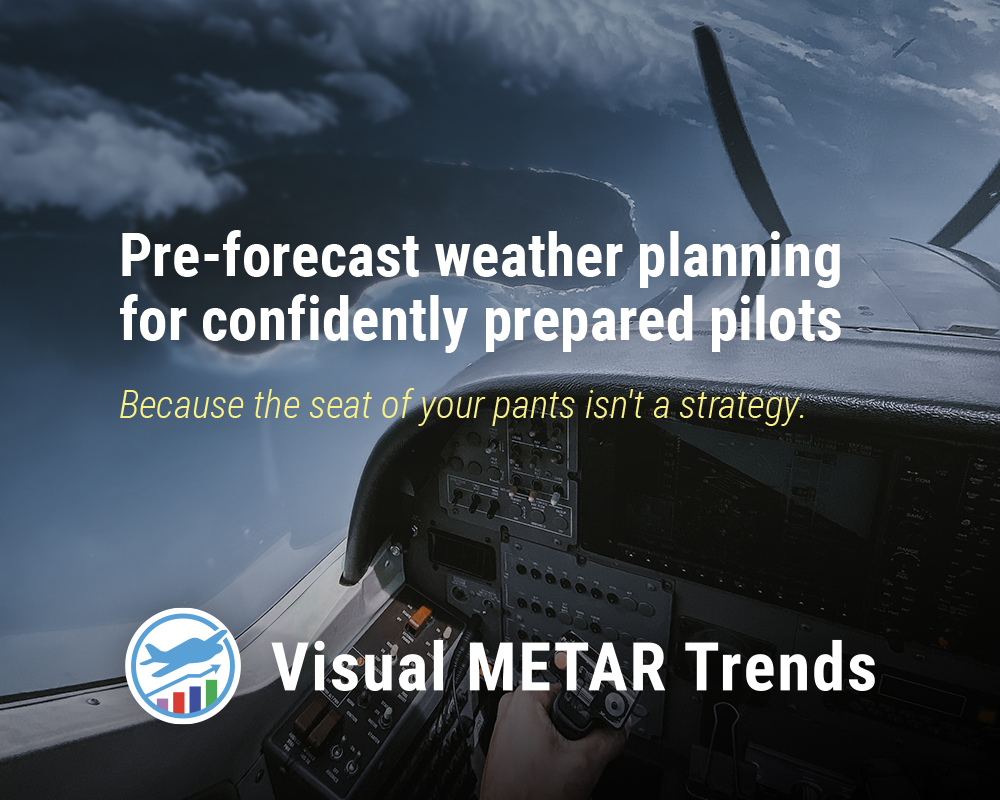
Helping pilots leverage data science to demystify weather patterns.
Sign up for free to get started. See visual and interactive weather trends, customized for your airports. (scroll down for examples)
Imagine you're planning a cross-country to somewhere you've never been. It's months in advance, and there's no forecast available to tell you whether to expect VMC or IMC. How do you plan? Do you call the airport manager? Find someone who flew there last year? Find a pilot online based at your destination?
Assuming your destination airport is one of America's ~2,500 that has METARs, then historical METARs could contain some very good hints. But how to access, aggregate, and act on them?
Visual METAR Trends solves this data gap for pilots. Our service generates visual and interactive summaries of years' worth of an airport's METARs -- filterable by calendar month and hour of the day. Use our visual data to:
- Start pre-forecast weather planning
- Understand probability of VFR conditions
- Research historical VFR conditions at airfields, to gain insight on when/where to begin training
- Learn about prevailing winds based on month and time of day
- Plan your departure/arrival times for favorable conditions
- Build a mental model on what runway you can expect
- Select your approaches
- Better understand the area's macro weather trends
- Improve your situational awareness
Ultimately, Visual METAR Trends can aid your planning, increase your confidence, and improve your safety margins.
Sign up for free to get started.
Below is an example airport comparison between KSAN and KORD.
Note: In some cases, it may take up to 30 seconds for these plots to be generated. There is a lot of data to parse!
Flight Categories
Temperatures
Altitudes
Precipitation and Humidity
Wind
Wind Direction
Headwind and Crosswind
Wind Speeds
Wind Speed (without gust)
Wind Speed with Gust
Gust Factor
Airport Info
Flight Categories
Temperatures
Altitudes
Precipitation and Humidity
Wind
Wind Direction
Headwind and Crosswind
Wind Speeds
Wind Speed (without gust)
Wind Speed with Gust
Gust Factor
Airport Info
Sign up for free to get started.